Life Saver Original Review by Johnkmccubbin91 at Comic Vine
This series of
Iron Man has been very up and down so far, as it started of with a good issue, followed by a terrible second issue, and now with a good third issue. Was the second issue a blip or is this an inconsistency we'll see more often, I hope the former, as I'm a big Iron Man fan and the previous run (
The Invincible Iron Man) by Matt Fraction and Salvador Larroca was brilliant.
Plot
This issue sees Iron Man once more in search of another person using the Extremist. This time he's heading to Colombia where a wealthy drug dealer has a version of the
Extremis, and has Living Laser, Vibro, and Firebrand protecting it.

Review
This was probably the best issue in this series so far and I hope that the series will keep at this quality, if not better. Kieron Gillen has done a much better job on this issue, and he's showing that he is still a good writer. I loved his work on
Journey Into Mystery, and am looking forward to his upcoming
Young Avengers series but I have however been disappointed with this series so far. Although this issue was much better than the last, which was very bad, it still isn't quite to the standards I'd expected. He has however put a lot of thought into this issue, and although some of the ideas didn't pay off, some did. I also liked how he was able to add emotion to this story, and how due to all these stories being mini-stories it's easier to forget a poorer one. I also loved how he attempted to add some fun humor to this issue, and although again some of it didn't work I can appreciate the effort as Tony is meant to be a funny character from time to time.
Greg Land's art is actually starting to grow on me a lot more than it's done in the past. Although there is still problem with some facial features, like smiling and that looking awkward his art has however improved. Another thing I didn't like about this art was how he drew women very similar, so I enjoyed when I saw that he drew two women differently (the drug dealers daughter Juliana, and Fireband), although Fireband and
Pepper Potts look similar. I've also liked how he's drew Iron Man's armor over the series so far, and loved seeing a new suit of armor this issue, although I'll talk more about that later. I also like how most of his art is very detailed, and even though some of these details don't quite look right it's nice to see them there.
 |
| The Invisible Iron Man |
The new suit in this issue was very interesting and one of my favorites so far. The armor itself looks very sleek, and is very well designed but it's special feature is what I liked the most. This suit of armor has the ability to bending the light around the wearer, essentially turning them invisible. This is a very handy feature and allows Tony to do his business a lot more subtly, sneakily, which isn't usually easy for Tony. I also loved how Land drew this suit of armor, and it was probably the best design I've seen in this series. What I like about it is how it keeps the black color which this series has shown suits Iron Man, and make it something unique at the same time.
 |
| Holographic Camouflage |
The new suit Iron Man wears in this issue also allows the wearer to take on the identity of anyone it scans taking their likeness and voice. This is also a brilliant feature and I loved how Land drew the change between the armor and the person it was mimicking. The comments he makes during this sequence saying that he's made Black Widow's job redundant was also very interesting, and I can't help but imagine how Black Widow would respond to that.
Nearer the start of this issue there was meant to be a funny sequence between Tony and Pepper were Tony jokes about making the perfect toasted sandwich with cheese. I liked how Gillen attempted to add humor to Tony as it's a big part of his character, but I personally didn't think it paid of this time. There was however one part of this sequence I found slightly funny, and that was when Tony was eating the sandwich of a mechanical arm whilst suiting up.
 |
| Iron Man vs. Living Laser |
Finally we get to see some proper Iron Man villains. Okay they may not be the best villains out of Iron Man's rouges gallery, and they are certainly no Mandarin or Crimson Dynamo but they are still better than the excuse of villains we got last issue. Although I've never been a big fan of the Living Laser, and don't know a great deal about the other two you need villains like them in this sort of story, and although it is interesting seeing Iron Man facing huge villains he needs a technical villain to work of of, making the fight more symmetrical. It was also nice that the villains were all in different colors making them stand out, and that none of them were in a similar color to Iron Man, which may have made the fight a bit confusing to differentiate between the characters. I also liked the fight in general and thought Land drew it perfectly adding ton's of action, and drama to the sequence.
Final Verdict
This was a good issue, and much better than the last issue. It is still however not a perfect series, and has a lot of room for improvement, but if it keeps at this kind of standard you can be sure to have a decent series.
Rating: 4/5
What I Thought
Cover - 4/5
Art - 5/5
Colors/Ink/Lettering - 5/5
Layout/Flow - 4/5
Story - 3/5
Verdict - 3.9
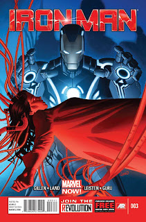
While the main cover is nothing special, I really enjoy the variant covers of his suits schematics and the colors on second variant are just stunning. This goes hand in hand with the art in the issue, unlike John I didn't find faults with the facial features, and the colors were beautiful. I still find this story arc kinda boring and I'm waiting for something more to happen. So far Extremis has been used for little that would be considered a threat to Stark.


Comments
Post a Comment